We demonstrate how element settings are specified and set by a special formatter for an demo article content. The formatter's configuration defines different element settings used by the formatter to format the same article in many different ways.
1 The result
Below you see the same demo article content, but with different element settings.
If you are in offline mode, you see edit points at the demo articles. Hover over the edit points and click the small gear wheel that appears to edit the element settings. See how the articles appearance changes if the settings are altered.
Element Settings 1
29/08/14
Hover over the edit point and choose the element settings button from the appearing menu. There you can change my appearance.
Settings values:
Text field "Text" = Element Settings 1

Check box "Show Image" = false

Date picker "Date" = 1409268360000

Radio buttons "Date Format" = date
Element Settings 2
7/08/14 12:56
Hover over the edit point and choose the element settings button from the appearing menu. There you can change my appearance.
Settings values:
Text field "Text" = Element Settings 2

Check box "Show Image" = true

Date picker "Date" = 1407408960000

Radio buttons "Date Format" = both
2 Example resources and the interesting spots
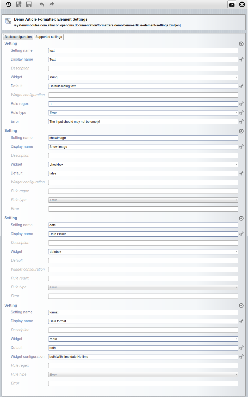
For the above example a special formatter for the "Demo Article" content was created and configured. In the formatter configuration the element settings are configured, while in the formatter, the settings are read. Depending on values of the settings, the content is formatted differently.
The configuration is done in the "Supported Settings" tab of the formatter configuration. See the tab "Supported Settings" in the configuration below.

The Settings that are configured in the formatter configuration shown above can be accessed in the configured formatter via their "Setting name".
Note that there are two ways to access element settings:
- Via EL:
${cms.element.settings['setting name']} - Via a tag:
<cms:elementsetting name="setting name" default="defaultvalue" />
<%@page buffer="none" session="false" trimDirectiveWhitespaces="true" %>
<%@taglib prefix="cms" uri="http://www.opencms.org/taglib/cms"%>
<%@taglib prefix="c" uri="http://java.sun.com/jsp/jstl/core"%>
<%@taglib prefix="fmt" uri="http://java.sun.com/jsp/jstl/fmt"%>
<fmt:setLocale value="${cms.locale}" />
<cms:formatter var="content" val="value">
<div style="margin-bottom:30px;">

	<%-- Abbreviate "cms.element.settings" with "settings" --%>
	<c:set var="settings" value="${cms.element.settings}" />

	<%-- Set the title of the article via an element setting --%>
	<div class="headline">
		<h3>${settings['text']}</h3>
	</div>
	<div>

		<%-- Check if the image should be shown --%>
		<c:set var="showing" value="${settings['showimage']?settings['showimage']:false}" />
		<c:if test="${showing && value.Image.isSet}">
			<%-- Show the image --%>
			<div style="float:left;margin-right:10px;margin-bottom:10px;">
				<cms:img src="${value.Image}" width="200" />
			</div>
		</c:if>

		<p>
			<%-- Get the date and show it --%>
			<c:set var="date" value="${settings['date']}" />
			<c:if test="${not empty date}">
				<i><fmt:formatDate value="${cms:convertDate(date)}"
				                   dateStyle="SHORT"
				                   timeStyle="SHORT"
				                   type="${settings['format']}" /></i>
				<br/>
			</c:if>
			<%-- Show the text of the article --%>
			${value.Text}
		</p>

	</div>
	<div style="clear:left;"></div>

	<%-- show the element settings --%>
	<h4>Settings values:</h4>
	<div>
		<pre>
<b>Text field</b> "Text" = <cms:elementsetting name="text" /> <br/>
<b>Check box</b> "Show Image" = <cms:elementsetting name="showimage" default="false" /> <br/>
<b>Date picker</b> "Date" = <cms:elementsetting name="date" /> <br/>
<b>Radio buttons</b> "Date Format" = <cms:elementsetting name="format" />
		</pre>
	</div>
</div>
</cms:formatter>