With OpenCms version 9.5 containers have become much more flexible than before. In particular three features have been added:
- containers can be nested
- containers can have permissions attached
- containers can have a param attribute that can be evaluated in formatters
- containers can display a default text if they are empty
In this demo we explore all of these features. We define a layout content that exposes one, two or three nested containers. Via the layout content, you can also set which users can add or remove contents in the exposed containers.
The example is simple, but somehow artificial. A real use-case where all the new features play together is the grid demo shipped with OpenCms 9.5. In this demo the template is designed as in a modular construction system:
- A template jsp exposes just one container where only template developers can add contents.
- In the template's container, template developers can place template rows that expose new containers (where the template developer can decide who can add contents)
- In containers exposed by template rows it is allowed to place layout rows, which themselves make up new containers.
- The param attribute is used to forward information from template row containers to layout rows.
That everything fits together perfectly in the demo, other features are used as well:
- Element views are used prevent edit points from overlapping and have a clear focus on what you are editing
- Permissions on resource types are used allow adding and editing template rows only for template developers and to allow element authors to add layout rows - but not to add new ones.
1 The result
The result shows a layout element that exposes different containers. Click on the upper-right edit point in the result to edit the layout element. For each container the layout element introduces, edit permissions can be set via "EditableBy". Here you can choose roles - log in as a user that has not the required role to experience that you can not add or delete elements from the container. In general, it is also possible to set edit permissions for groups or single users.
Play with the layout element and drop elements in the containers exposed by the layout element. You can also add another layout element. Be aware that the demo articles will only fit in containers of type "nested-demo-content".
Demo article

I'm just a normal demo article.
Value of my containers param attribute: 1 of 2
2 Example resources and the interesting spots
The most interesting spots are the formatter of the layout element and its configuration.
2.1 Formatter of the layout element
The formatter of the layout element renders the containers as specified in content. Here's how that works:
<%@page buffer="none" session="false" trimDirectiveWhitespaces="true" taglibs="c,cms,fmt,fn" %>
<cms:formatter var="content">
	<div class="row">
	<c:set var="containers" value="${content.valueList.Container}" />
	<c:set var="containerNum" value="${cms:getListSize(containers)}" />
	<c:set var="containerCols">
		<fmt:formatNumber value="${12 div containerNum}" maxFractionDigits="0" />
	</c:set>
	<c:forEach var="container" items="${containers}">
		<div class="col-lg-${containerCols} col-md-${containerCols}
		     col-sm-${containerCols} col-xs-${containerCols}">
			<cms:container name="${container.value.Id}"
			               type="${container.value.Type}"
						   editableby="${container.value.EditableBy}"
						   tagClass="big-colored-border" param="1 of ${containerNum}">
				<h4>
					Please add content (if you have role "${container.value.EditableBy}")!
				</h4>
			</cms:container>
		</div>
	</c:forEach>
	</div>
</cms:formatter>
The most interesting part is the <cms:container> tag. Using this tag, the formatter exposes a new container. Setting the (optional) attribute editableby, it restricts the users that are able to add or remove contents from the exposed container. Via tagClass we add a css class to the HTML-tag (div) that is rendered for the container. In the example, the gray borders are added by that class. The type attribute is used to specify which formatters can be used in the container and the name attribute becomes (prefixed with the layout element's id) the id of the container in the container page, and the HTML-tag rendered by the container tag. Last but not least, the (optional) param attribute is used to attach some extra data to the container: Here, the information on which container of how many in the containers in the row this one is.
In the body of the <cms:container> tag we placed some HTML. It is shown whenever the container is empty.
2.2 Formatter configuration of the layout element
In the formatter configuration, "Nested containers" has to be checked, since the formatter exposes nested containers.
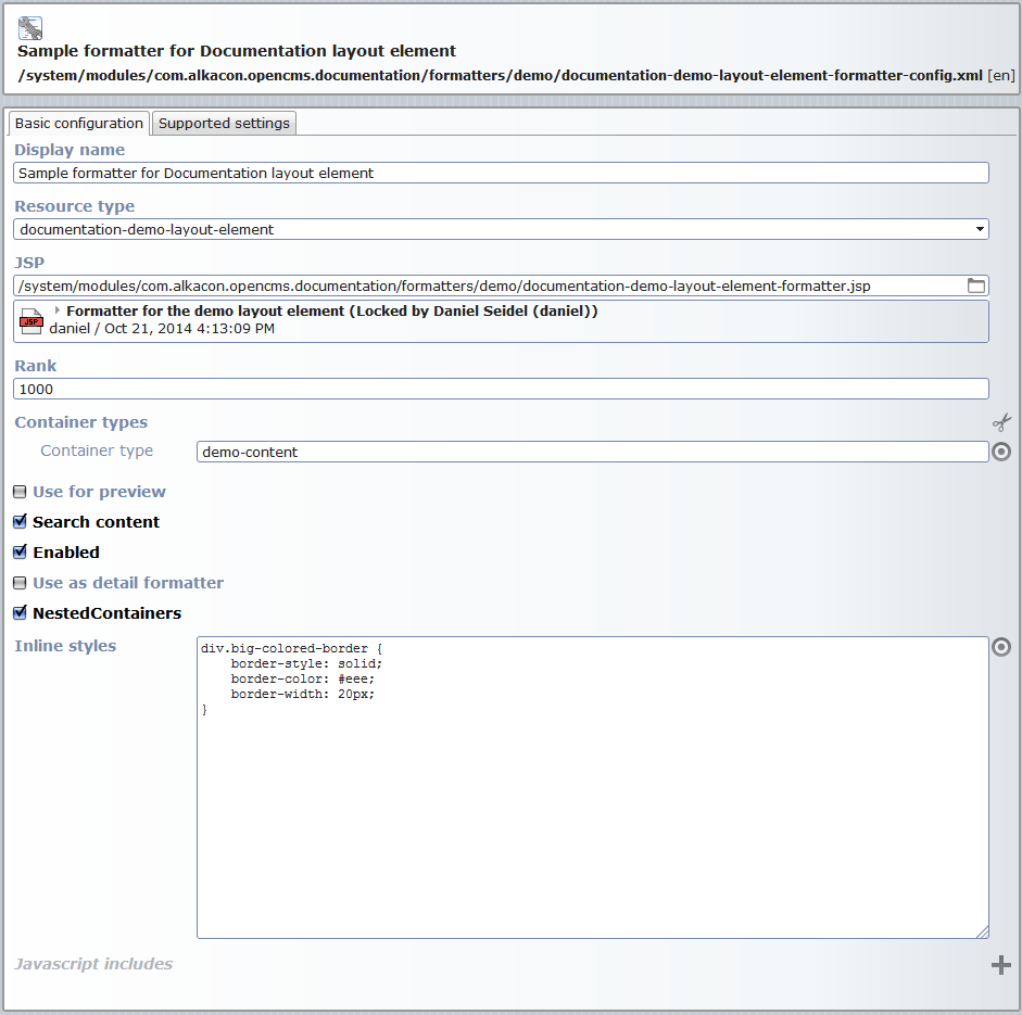
In our demo example, we also added the css for the big colored border to the formatter configuration as inline style.
3 The formatter of the demo article - reading the container's extra information
The formatter used for articles in the nested containers read the surounding container's param attribute and output the value. Look for ${cms.container.param} in the formatter code below.
<%@page buffer="none" session="false" taglibs="c,cms" %>
<cms:formatter var="content" val="value" rdfa="rdfa" >
<div style="margin-bottom:30px;" ${not value.Image.isSet?rdfa.Image:""} >
    <div class="headline"><h3 ${rdfa.Title}>${value.Title}</h3></div>
	<c:if test="${value.Image.isSet}">
		<div style="float:left;" ${rdfa.Image}>
			<cms:img src="${value.Image}" height="100" width="300" />
		</div>
	</c:if>
    <div ${content.rdfa.Text}>
        ${value.Text}
    </div>
	<div style="clear:left;"></div>
	<c:if test="${not empty cms.container.param}">
		<p>
			Value of my containers param attribute: <em>${cms.container.param}</em>
		</p>
	</c:if>
</div>
</cms:formatter>
Of course, the param attribute on containers is very flexible and may have many more realistic use cases than the one shown here.